Mountain painting can change your living room’s atmosphere with a single image. A well-chosen mountainscape adds depth, mood and scale at once, so pay attention to style, color and size. Below are practical options and clear examples to help you match brushwork, saturation and scale to your furnishings and light.
Decide early whether you want a saturated acrylic statement or a calm watercolor study. Different media use different techniques—wet-in-wet washes, glazing or palette-knife passages—so plan the finish you want rather than relying on accidental effects.
There’s a short beginner tutorial below that walks through a reliable process for painting mountains, with step-by-step tips focused on acrylic peaks. By the end you’ll know which mountain landscape suits your room and how to begin with confidence. Match the painting’s scale and color intensity to your light and furniture, and the rest becomes an enjoyable creative process.
Quick summary
- Decide the role: Choose whether the mountain painting will be a bold focal point or a soothing accent, and let that decision guide scale, color intensity and composition.
- Match the palette to light: Test small swatches on the actual wall at different times of day and coordinate colors with textiles and finishes so the piece behaves as expected under changing light.
- Choose the medium: Select acrylic for bold, modern color; oil for tactile depth and impasto; or watercolor for airy, luminous recession based on the presence you want.
- Work broad to fine: Block in sky and major planes first, then add peaks, texture and highlights after the foundation is stable to avoid overworking early layers.
- Consider commissioning: Photograph your wall with dimensions and light, request a small mockup or study, and commission a custom piece sized and colored for your space to remove guesswork.
Pick the right mountain painting style for your living room
Decide whether the work should command attention or quietly support the room. A bold focal point needs scale and saturated color, while a soothing accent benefits from softer edges and restrained contrast. Think about ceiling height, how furniture frames sightlines, and how people will approach the piece so it reads as intentional.
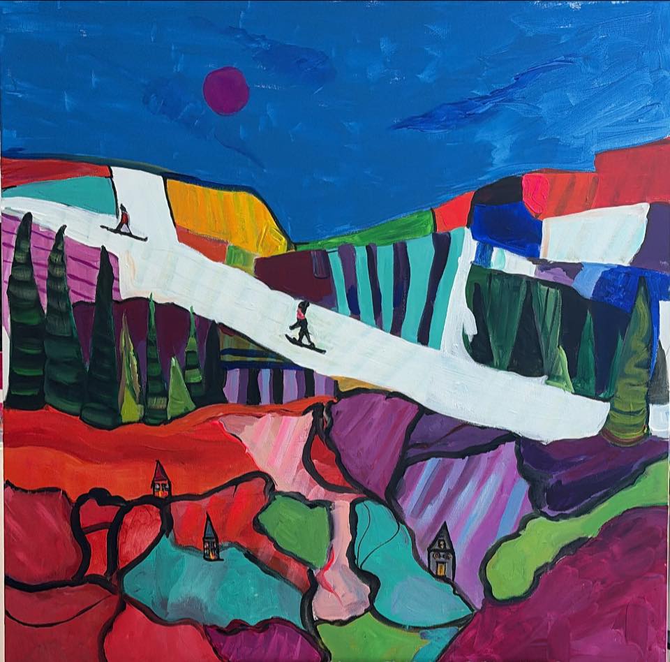
Acrylic mountain painting works especially well above a sofa or mantel because it reads from a distance. Use large formats, confident brushwork or palette-knife texture so ridgelines remain legible across the room. Pair a saturated piece with neutral furniture and simple accessories, and place warm directional light to keep the painting as the anchor.
For calmer, meditative rooms, limited-palette watercolor and wet-in-wet washes create airy recession and soft light. Frame those works under glass with a wide mat to protect the paper and give visual breathing room. If you want surface presence, textured oil with palette-knife peaks delivers real tactility; start with a tonal underpainting, push cool shadows back, and add warmer highlights on raised edges.
Palette ideas to set mood and match your décor
Color sets mood faster than composition, so test small swatches on the exact wall where the artwork will hang. Look at swatches in morning and evening light and compare them to your textiles and finishes. Trying mixes on scrap canvas or paper before committing helps the finished piece blend with the room.
Sunrise and sunset palettes use warm oranges, pinks and lavender to give peaks a soft, glowing edge that pairs well with mid-tone sofas and warm woods. Mix quinacridone or alizarin with cadmium yellow for a glowing midtone, and temper shadow mixes with ultramarine plus a touch of burnt sienna for depth without muddiness. Use a slightly warm titanium white for highlights so sunlit areas retain their glow.
Cool alpine palettes focus on ultramarine, cerulean and soft greens for a fresh, airy feel that calms busy interiors. For realistic snow shadows, blend ultramarine with a little burnt sienna and white to create a muted blue-gray that reads natural from across the room. Pair these tones with pale grays, navy accents and natural fibers; cool palettes often work well in north-facing spaces or rooms with lots of plants.
Autumnal mixes of burnt sienna, raw umber and warm greens create a layered, cozy look that complements textured rugs and throws. Add warm highlights by tinting titanium white with a whisper of cadmium yellow or alizarin. Monochrome and neutral studies depend on careful value shifts and edge control rather than many hues, so focus on brushwork to keep interest.
Materials and formats: acrylic, oil or watercolor
The medium shapes scale, texture and how a piece reads in the room, so choose with display in mind. Transparent washes feel airy, thick oil impasto reads as a tactile centerpiece, and acrylic lands between those options with fast drying and strong color. Your medium choice also determines supplies, framing and mounting.
For watercolor, use large rounds and mops in sizes 8 to 16 to lay skies and gradients, plus smaller rounds for ridge and tree detail. Pick cold-press paper in the 300–400 gsm range for good texture and durability, and keep masking fluid, a mixing tray and quality synthetic or mixed-squirrel brushes for reliable water holding during wet-in-wet work. Mat and use UV glass to protect transparent layers and keep colors true over time.
Acrylics and oils share many tools: synthetic flats, filberts and a palette knife cover most needs. Oil allows longer open blending, while acrylic dries fast and layers quickly, so choose supports and brushes with those behaviors in mind. Keep a primed stretched canvas sized for viewing distance and a basic brush set: a large flat, a medium round and a small detail brush.
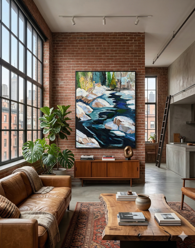
Scale and framing finish the presentation: as a rule, art above a sofa should be about two-thirds the sofa width for balance. Use floater frames or deep cradled panels for textured works and reserve mats with glass for watercolors. Document size, medium and provenance when you ship or insure an original.
A simple step-by-step mountain painting process for beginners
- Start broad: Begin with a light wash or gradient sky to set atmosphere and anchor the composition. For acrylics use a thinned flat brush in horizontal strokes; for watercolor work wet-in-wet with a large loaded round to get smooth transitions. Lightly map mountain silhouettes with pencil or a thin brush, keeping shapes varied and leaving room for midground and foreground so values can recede naturally.
- Build form and depth: Work from back to front. Cool and desaturate color on distant ranges tosuggest air and distance, then increase contrast as you bring forms forward. In acrylic wait for layers to dry before adding darker values, and in watercolor control paper wetness and lift pigment with a damp brush to keep transitions clean. Thin glazes, soft scumbles and careful edge control help each plane remain readable.
- Add texture and highlights: Apply texture, ridgelines and snow highlights once values are set. Use a palette knife or dry brush in acrylic for rock texture and thicker paint toward the foreground, and in watercolor employ lifting or a dry brush to suggest grit. Mix shaded snow with a cool blue plus white and warm sunlit snow slightly toward yellow, and use a small round for crisp ridge highlights so peaks read three-dimensional from a distance.
- Finish and refine: Sharpen foreground tree lines, add reflections or water sparkles, and step back to check overall balance. Apply bright accents sparingly so they pop without flattening the scene. Varnish acrylics once fully cured and mat and frame watercolors for protection. After some practice, review common studio mistakes and hanging tips to keep the work looking fresh on the wall.
Common mistakes, quick fixes and hanging tips
Beginners often chase detail before establishing depth or overwork areas until the painting loses life. Correct non-destructively by using thin glazes, gentle scumbles and selective softening instead of repainting whole sections. Putting the piece aside and returning with fresh eyes helps decide what to simplify while preserving texture.
If distant ranges look flat, cool and lighten that plane with a thin glaze or soft scumble to push it back visually and blur hard edges. Reduce contrast and remove small details on receding forms so the eye reads simpler shapes first and enjoys detail closer up. Often one subtle cool layer is enough to restore believable atmosphere.
Hanging and small on-site fixes matter as much as studio corrections. Center artwork around 57 to 60 inches from the floor, lower the piece slightly above seating, and use soft directional lighting that reveals texture without glare. Try a temporary paper mockup and live with it for a day before committing, and consider thin glazes, subtle cropping or a slim painted border as simple adjustments.
If a tailored solution makes more sense, commissioning a custom piece removes uncertainty. The section below shows how material and scale choices play out in real living-room makeovers.
Commissioning a custom mountain painting and living room case studies
When DIY doesn’t fit the brief, a commission lets you get exact scale and color harmony so the artwork fits the room. Commissions with Monique Paré begin with a short consultation where you describe room size, palette and the mood you want, and photos help show lighting and finishes. You receive a sketch or small color study for approval before Monique paints the signed original and ships it with a certificate of authenticity.
Three living-room makeovers show how scale and surface change the outcome. A pale Scandinavian interior was anchored by a misty, low-contrast study that softened warm woods and reflected northern light. A modern loft used one saturated acrylic mountain as a large focal point (see The Monarch — Original Acrylic Stag Painting by Monique Paré for another bold example), while a cozy cottage received a warm-toned oil study that echoed textiles and tied pillows and rugs together.
Originals ship to North America, securely packaged and insured, and Monique provides framing guidance, care instructions and a photographed record of provenance for each piece. Expect a 3 to 6 week timeline for a typical original depending on size and medium, with small studies and unframed works available faster. Digital studies are also offered for immediate reference; for example Winter River — Digital Study by Monique Paré is available as a quick-start option. To start a commission, photograph your wall with dimensions and morning and evening light, then request a small color study or sketch. Browse originals such as Winter River — Original Acrylic Landscape by Monique Paré.
Choose your perfect mountain painting
A mountain painting can anchor a room or support it quietly, depending on the mood you want. Decide whether you want a bold focal point or a soothing accent, let color lead, and match scale and placement to your seating and sightlines.